Blackletter or gothic script fonts are hugely popular in a range of modern cultures. Metal bands, tattoo artwork and extreme sports brands all make use of the awesome blackletter style. Often the sharp letter shapes are enhanced with elaborate swirls and decorations. Follow this step by step guide to customizing your own gothic typographic design, we’ll be modifying the original vector letters in Illustrator before moving over to Photoshop to add a cool distressed and metal effect finish to the artwork.
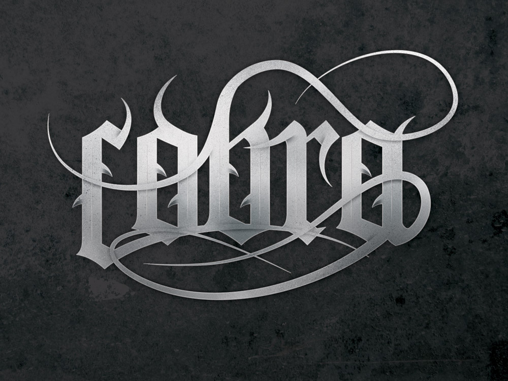
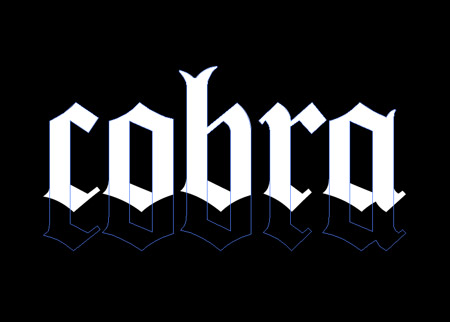
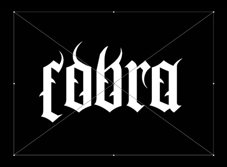
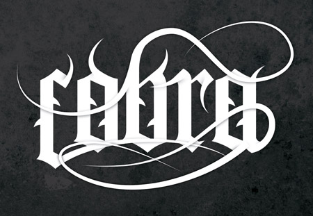
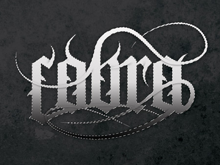
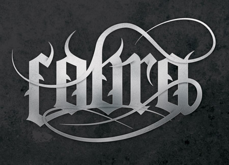
The design I’ve been working on features the word ‘Cobra’ – Simply because it sounds pretty bad-ass! The blackletter type has been customised and modified with additional swirls, curls and various pointy bits which add plenty of visual interest while disguising the original wording.
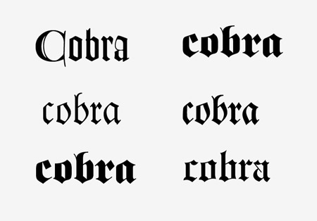
The first stage of the design process will be in Illustrator, here we’ll create and tweak the gothic script lettering. The first step is to pick out a bunch of blackletter style fonts. There’s a huge range and different styles to pick from. I wanted a font that used straight edges on most of the letters, as opposed to being rounded. I eventually picked out
Cloister Black as my typeface of choice.
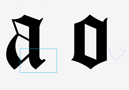
I wasn’t too keen on the shape of the letter A, so I took a copy of the O, created outlines from the text (CMD+Shift+O) then used the Direct Selection Tool to take portions of the original letter A to build my own customised version. The original letter O, the little point at the top and the terminal at the bottom were all combined with the Merge option from the Pathfinder palette.
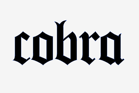
The new letter A was combined with the rest of the word and all the letters converted to outlines making them ready for customisation.
One of the first tweaks was to extend the letters to make the whole word taller, which was the main reason I wanted a font with straight edges. The lower half of the text was selected with the Direct Selection Tool and moved downwards (holding Shift to constrain the axis).
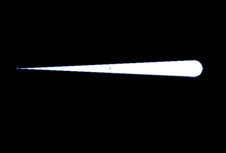
Elsewhere a new brush was created. A small circle was drawn, then the left hand point dragged outwards with the Direct Selection Tool. The bezier curves were removed from this point with the Convert Anchor Point tool to give a sharp point.
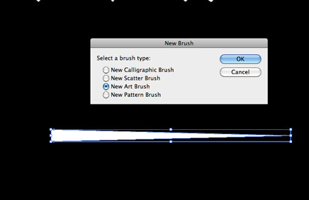
The rounded edge from the opposite end is then clipped off using a temporary square along with the Subtract option from the Pathfinder palette. This shape is then added as a New Art Brush by clicking the littler ‘new icon’ at the bottom of the Brushes palette.
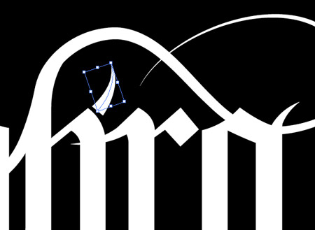
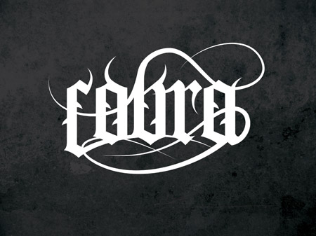
This new brush is used with the Brush Tool to draw some smooth swirly lines across the text. My Pen Tablet came in handy here, but the same effect could easily be created with a mouse. Double click the Brush icon to edit the Smoothness settings in order to generate nice flowing curves.
Smaller flicks were drawn and carefully positioned over key points of the text. When the edges are lined up the shape flows seamlessly.
More flicks were drawn and duplicated across the inner sections of each letter, giving a a kind of thorny or teethed appearance.
Some of the longer lines overlap the text, which seems a popular feature in this style of gothic typography design.
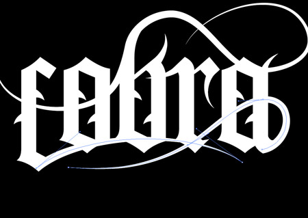
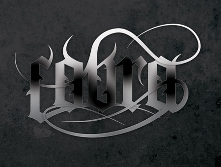
Various swirls, curls and sharp pointy bits later and the vector version of the type design is complete. Any tight angles and the position of each individual piece were adjusted to perfect the design.
In order to migrate the design to Photoshop while keeping the various objects separate, I had copy and paste each set of elements individually. To ensure they all remained aligned in Photoshop a temporary blank rectangle was also used with each selection.
As each element was pasted into Photoshop the temporary rectangle would keep everything aligned and scaled correctly, with each piece being placed on a new Photoshop layer.
A
rough stone texture was added over the black background and set to soft light to generate a cool and distressed background for the type to sit against.
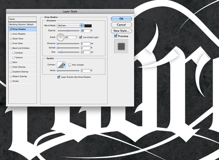
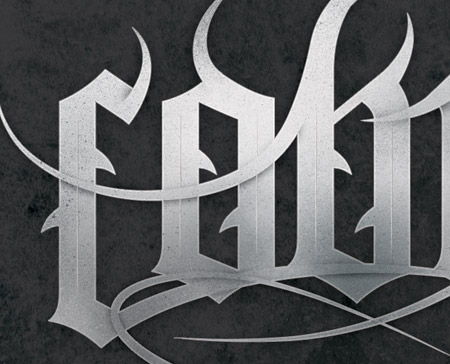
Each layer of typographic elements was then given a Drop Shadow. The settings were tweaked to create a subtle shadow by lowering the opacity and increasing the size.
The Drop Shadow layer style in the layers palette was then rasterized into a layer of its own by right clicking and selecting Create layer. This then allowed a Layer Mask to be used to erase out portions of the shadow with a soft brush, leaving shading in key places to give a three dimensional effect.
Drop Shadows were added to the other typographic pieces and each one adjusted with a layer mask. This shading allows the swirls to either blend into the type or flow on top of the wording.
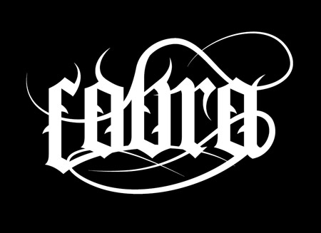
Once all the shadows are in place the design is given an extra level of depth and dimension, as well as bringing a little legibility back to the wording.
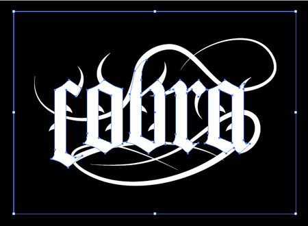
A selection of the whole design was made by CMD-Shift-clicking the thumbnails of each layer in the Layers palette. This selection was then filled with white on a new layer.
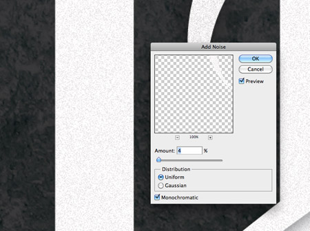
A subtle noise texture was added using the Noise filter. A small about of 3-4% is all is needed to give a tactile feel to the otherwise unrealistic smoothness of the white fill.
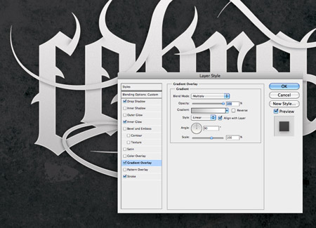
A Gradient Overlay was also added as a layer style to this new layer. The gradient flows from grey to white vertically up the design.
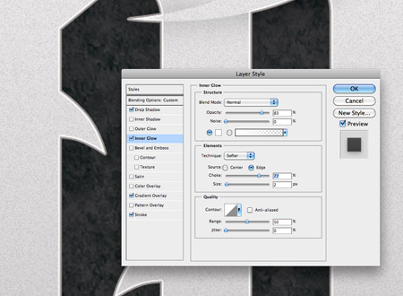
An Inner Shadow and Stroke combination also helped add a subtle chamfered edge effect. The Inner Shadow gives a thin 2px white border while the Stroke adds a darker grey border to the outside.
The selection of the whole design is loaded once again, then filled with a black to white gradient on a new layer. Setting this layer to Hard Light allowed the black to interact with the grey from the layer below adding more shading.
Additional spots of black were dotted around the design, which were also given the Hard Light blending mode to add more levels of shading and tone.
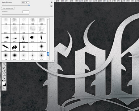
A
spray paint Photoshop brush was used to create some splattery textures across the type, adding more detail and subtle marks which all help give a more tactile feel.
All these additions of texture and tone help give a metallic feel to the design.
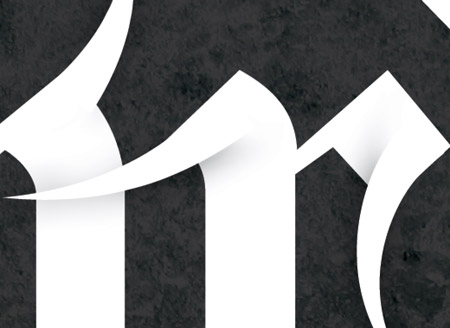
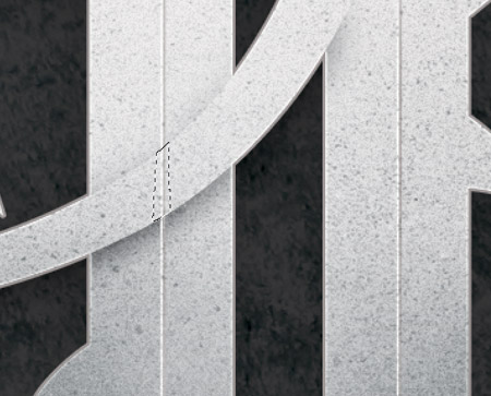
Two thin vertical lines were added to each letter. One filled with white, the other in grey, which gives a chiselled line effect. Layer masks were added to each line to both fade out the upper and lower edge as well as mask out where any swirls overlap the text.
These chiselled lines help add that little extra to the metal effect, while enhancing that impression of multiple dimensions where the swirly lines clearly flow over the top of the letters.
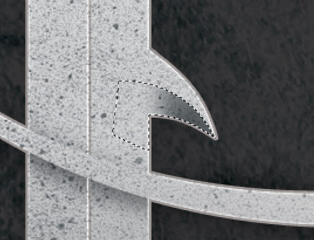
The Pen Tool was used to draw small selections over the pointy areas of the text, then a quick dab with a soft brush helped add a bit of dimension and visual interest to these elements.
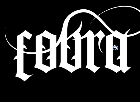
The final gothic blacketter typographic design is complete! The customisation of the letters is made easy with Illustrator’s editable paths, then Photoshop brings it all to life with realistic textures and different levels and shading and tone.
Source : spoongraphics